Syncfusion.Maui.Buttons
This package provides the functionality to utilize the features of Syncfusion® Maui Buttons controls and more.
Install
| Product | Versions |
|---|---|
| .NET |
README
Syncfusion .NET MAUI Buttons
The Syncfusion .NET MAUI Buttons package includes five fully-featured controls for .NET MAUI apps: Button, Segmented Control, CheckBox, RadioButton, and Switch. Each was built from the ground up for a native look and feel with rich customization, and works in Android, iOS, macOS, and Windows from a single codebase.
Documentation · Getting Started · API Reference · Demos on GitHub · Product Page · Release Notes
Controls in this package
| Control | Purpose |
|---|---|
| SfButton | Custom button with icons, predefined styles, rounded corners, and visual state customization |
| SfCheckBox | Select one or more options; supports checked, unchecked, and indeterminate states |
| SfRadioButton | Select one option from a set, with support for grouping radio buttons |
| SfSegmentedControl | Multiple segments where each segment acts as a separate button with text, image, or both |
| SfSwitch | Toggle between two states with fully customizable appearance |
Key features
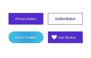
Button
- Text and background customization (
TextTransform,LineBreakMode,TextColor,Background). - Icon support with
ShowIconandImageSource, plus icon placement viaImageAlignment. - Predefined styles, rounded corners via
CornerRadius, stroke customization (StrokeThickness), and visual state customization using the visual state manager. - Custom content support through the
Content(DataTemplate) property.
CheckBox
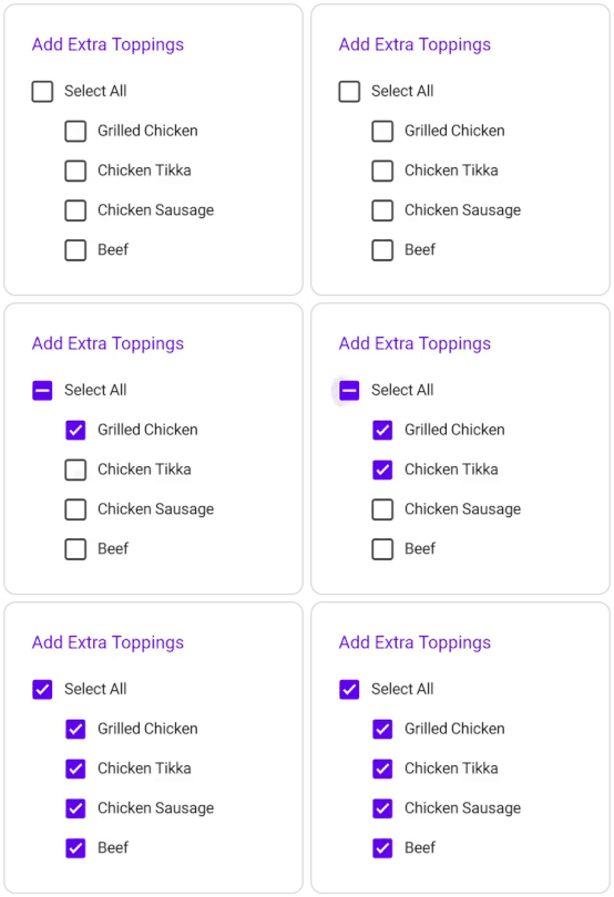
- Three-state checkbox (
IsCheckedsupportstrue,false, andnullindeterminate, enabled byIsThreeState). - State change notification via the
StateChangedandStateChangingevents. - Customize the check state, size, colors (such as
TickColor,CheckedColor,UncheckedColor), corner radius, and label placement.
Radio Button
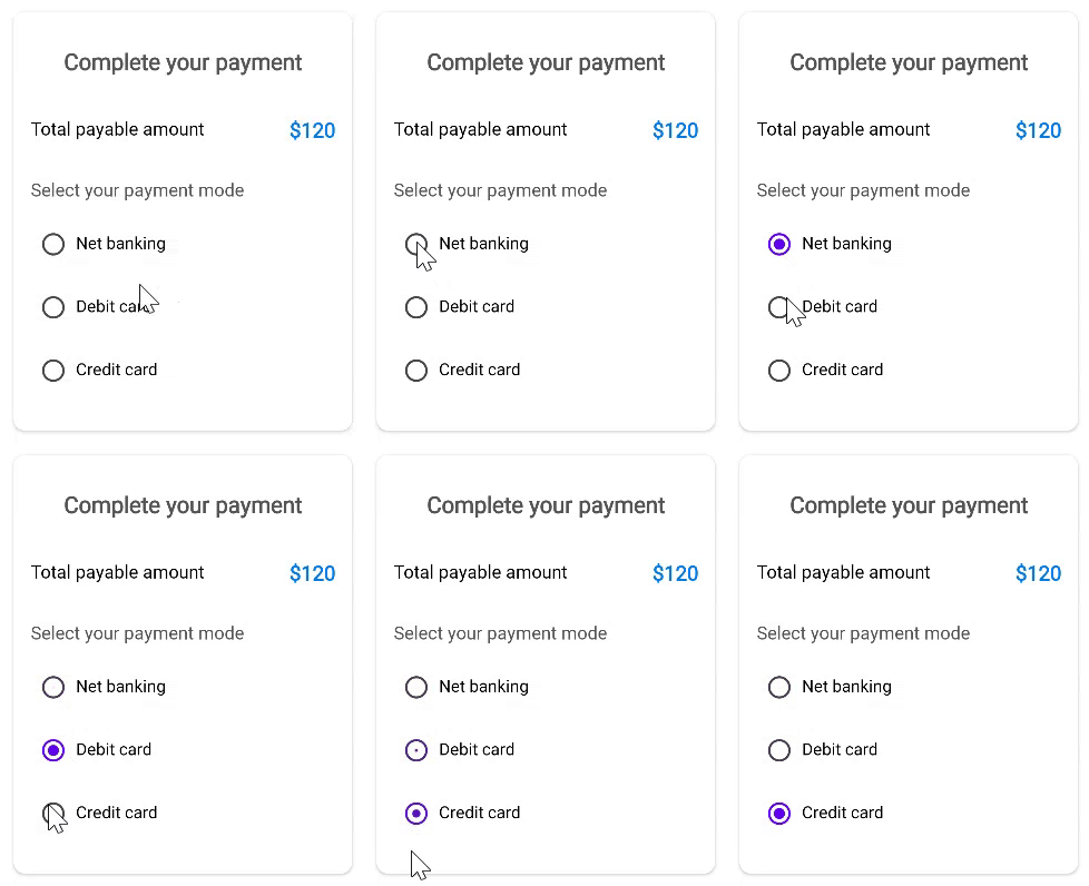
- Two-state radio button (
IsCheckedistrueorfalse). - Group radio buttons in an
SfRadioGroupso only one can be selected at a time; the group raisesCheckedChangedto notify which button was selected. - State change notification via the
StateChangedandStateChangingevents. - Customize the check state, size, colors (such as
CheckedColor,UncheckedColor), and label placement.
Segmented Control
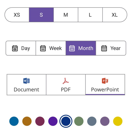
- Segments display text, an image (
SfSegmentItem.ImageSource), or both. - Selection notification via
SelectionChangedandTappedevents, withSelectedIndexto get or set the selected segment. - Overflow handling with
VisibleSegmentsCount, and programmatic scrolling withScrollTo. - Enable or disable segments at run time using
SetSegmentEnabled. - Customizable selection indicator (
SelectionIndicatorSettings), corner radius, stroke, and segment spacing.
Switch
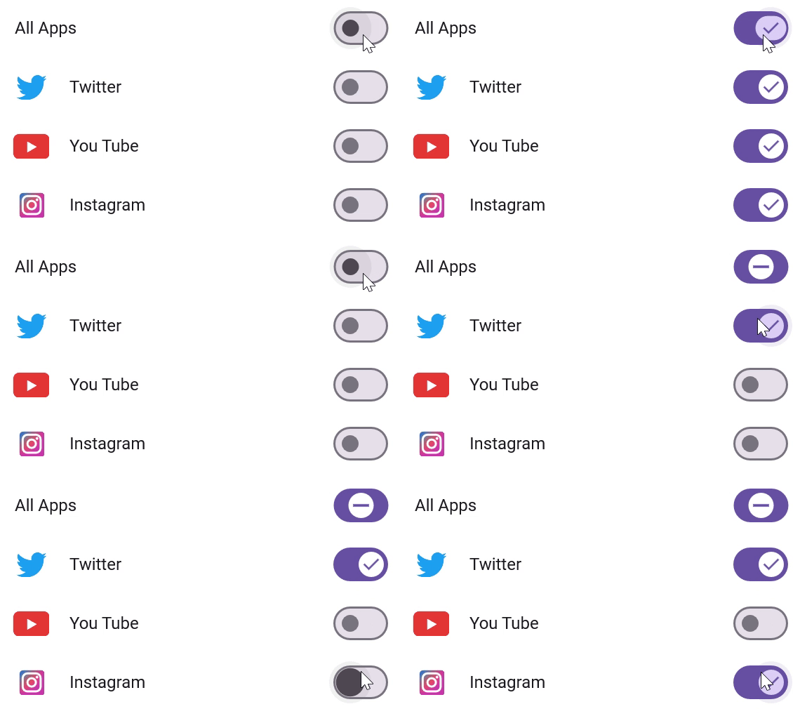
- Smooth toggle between on and off states (
IsOn), with an optional indeterminate state viaAllowIndeterminateState. - State change notification via the
StateChangedandStateChangingevents. - Fully customizable thumb and track through
SwitchSettings- including backgrounds, strokes, sizes, corner radii, and custom thumb/track images.
All controls
- Full styling support with built-in light and dark themes.
- Right-to-left (RTL) support, localization, and accessibility.
Supported platforms
| Platform | Target framework |
|---|---|
| Android | net9.0-android, net10.0-android |
| iOS | net9.0-ios, net10.0-ios |
| macOS (Mac Catalyst) | net9.0-maccatalyst, net10.0-maccatalyst |
| Windows | net9.0-windows10.0.19041, net10.0-windows10.0.19041 |
Minimum OS versions follow the .NET MAUI supported platforms.
Installation
.NET CLI
dotnet add package Syncfusion.Maui.Buttons
Package Manager Console
Install-Package Syncfusion.Maui.Buttons
Getting started
1. Register the Syncfusion core handler
In MauiProgram.cs, call ConfigureSyncfusionCore():
using Syncfusion.Maui.Core.Hosting;

public static class MauiProgram
{
    public static MauiApp CreateMauiApp()
    {
        var builder = MauiApp.CreateBuilder();
        builder
            .UseMauiApp<App>()
            .ConfigureSyncfusionCore();

        return builder.Build();
    }
}
2. Add the controls to your page
<ContentPage xmlns="http://schemas.microsoft.com/dotnet/2021/maui"
             xmlns:x="http://schemas.microsoft.com/winfx/2009/xaml"
             xmlns:syncfusion="clr-namespace:Syncfusion.Maui.Buttons;assembly=Syncfusion.Maui.Buttons"
             x:Class="YourAppNamespace.MainPage">

    <VerticalStackLayout Spacing="20" Padding="20">

        <!-- Button -->
        <syncfusion:SfButton Text="Submit" />

        <!-- CheckBox -->
        <syncfusion:SfCheckBox Text="Accept terms and conditions" IsChecked="True" />

        <!-- RadioButton -->
        <syncfusion:SfRadioButton Text="Credit card" />
        <syncfusion:SfRadioButton Text="PayPal" />

        <!-- Switch -->
        <syncfusion:SfSwitch IsOn="True" />

        <!-- Segmented Control -->
        <syncfusion:SfSegmentedControl>
            <syncfusion:SfSegmentedControl.ItemsSource>
                <x:Array Type="{x:Type x:String}">
                    <x:String>Day</x:String>
                    <x:String>Week</x:String>
                    <x:String>Month</x:String>
                </x:Array>
            </syncfusion:SfSegmentedControl.ItemsSource>
        </syncfusion:SfSegmentedControl>

    </VerticalStackLayout>

</ContentPage>
Run the app on any supported platform to see the controls in action.
Common scenarios
Respond to state changes
SfSwitch, SfCheckBox, and SfRadioButton raise StateChanging and StateChanged events so you can validate or react to user interaction:
private void SfSwitch_StateChanged(object sender, SwitchStateChangedEventArgs e)
{
    // e.NewValue is the new switch state (e.OldValue holds the previous one).
}
<syncfusion:SfSwitch StateChanged="SfSwitch_StateChanged" />
SfSegmentedControl raises SelectionChanged when the selected segment changes:
private void SegmentedControl_SelectionChanged(object sender, SelectionChangedEventArgs e)
{
    // e.AddedItems[0] is the newly selected segment.
    // e.RemovedItems[0] is the previously selected segment.
}
Group radio buttons
Place radio buttons inside an SfRadioGroup so selecting one automatically deselects the others:
<syncfusion:SfRadioGroup>
    <syncfusion:SfRadioButton Text="Small" />
    <syncfusion:SfRadioButton Text="Medium" IsChecked="True" />
    <syncfusion:SfRadioButton Text="Large" />
</syncfusion:SfRadioGroup>
Add an icon to a button
Set ShowIcon to True and provide an ImageSource; use ImageAlignment to position it:
<syncfusion:SfButton Text="Download"
                     ShowIcon="True"
                     ImageSource="download.png"
                     ImageAlignment="Start" />
For more features, see the Button, CheckBox, RadioButton, Segmented Control, and Switch documentation.
Dependencies
Installing this package also installs the following packages:
Microsoft.Maui.ControlsSyncfusion.Maui.Core
Licensing
This is a commercial product and requires a paid license. You have three options:
- Free Community License: for individual developers and small businesses. Check eligibility
- 30-day free trial: Start a trial
- Commercial license: View pricing
Register your license key
Register the key in MauiProgram.cs before the app is built:
Syncfusion.Licensing.SyncfusionLicenseProvider.RegisterLicense("YOUR_LICENSE_KEY");
For details, see Licensing overview. Use of this package is subject to the Syncfusion EULA.
Support and feedback
- Support tickets: Syncfusion Support Portal
- Community forums: .NET MAUI Forums
- Feature requests and bug reports: Feedback Portal
- Samples: Syncfusion .NET MAUI demos on GitHub
About Syncfusion®
Founded in 2001 and headquartered in Research Triangle Park, N.C., Syncfusion® has more than 26,000+ customers and more than 1 million users, including large financial institutions, Fortune 500 companies, and global IT consultancies.
Today, we provide 1600+ components and frameworks for web (Blazor, ASP.NET Core, ASP.NET MVC, ASP.NET WebForms, JavaScript, Angular, React, Vue, and Flutter), mobile (.NET MAUI, Xamarin, Flutter, UWP, and JavaScript), and desktop development (WinForms, WPF, WinUI, Flutter and UWP). We provide ready-to-deploy enterprise software for dashboards, reports, data integration, and big data processing. Many customers have saved millions in licensing fees by deploying our software.
[email protected] | www.syncfusion.com | Toll Free: 1-888-9 DOTNET
Changes from Previous Version
Adoption Assessment
A verified publisher signal is available. Assess fit from the package's supported frameworks, license and dependency graph rather than popularity alone.
Related Guides & Workflows
Learn how to evaluate, integrate, or audit this package in your .NET project.