.NETFramework4.6.2
Input for WPF includes several editors that support masking, numeric formatting, validation, multi-select and range selection.
Published
May 29, 2026
4mo ago
Total Downloads
28.5K
28,540
Install
dotnet add package C1.Xaml.WPF.Input --version 4.6.20261.6
| Product | Versions |
|---|---|
| Other |
README
About
The ComponentOne WPF Input library includes several advanced editors for capturing special input including C1NumericBox, C1MaskedTextBox, C1MultiSelect, C1ComboBox, C1DropDown, C1RangeSlider, C1FilePicker, C1Rating and C1TagEditor.
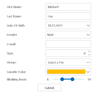
Key Features:
- Format and parse numbers and masked text
- Select multiple items from a checklist
- Type or select items like a tag editor
- Edit a numeric range visually using a two-thumb slider
- Design a custom drop-down UI with ease
- Create a custom shape rating control (five stars) to let users provide feedback
Note: Date, time and color input controls are in separate libraries. Learn more at developer.mescius.com/componentone/wpf-ui-controls/custom-input-controls-wpf.
Resources
Changes from Previous Version
No structural changes between v4.6.20252.919 and v4.6.20261.6.
Adoption Assessment
Assess this package against its supported frameworks, license, maintenance signals and dependency graph before making it a project standard.
No SPDX license expression is published. Review the license text and your organisation's policy before redistribution.Compatibility metadata lists 1 target framework; confirm the exact target used by your application.
Related Guides & Workflows
Learn how to evaluate, integrate, or audit this package in your .NET project.