.NETFramework4.6.2
Input for WPF includes several editors that support masking, numeric formatting, validation, multi-select and range selection.
Published
Mar 12, 2024
2y ago
Total Downloads
28.5K
28,540
Install
dotnet add package C1.Xaml.WPF.Input --version 4.6.20233.821
| Product | Versions |
|---|---|
| Other |
README
About
The ComponentOne WPF Input library includes several advanced editors for capturing special input including C1NumericBox, C1MaskedTextBox, C1MultiSelect, C1ComboBox, C1DropDown, C1RangeSlider, C1FilePicker, C1Rating and C1TagEditor.
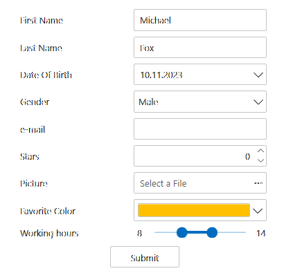
Key Features:
- Format and parse numbers and masked text
- Select multiple items from a checklist
- Type or select items like a tag editor
- Edit a numeric range visually using a two-thumb slider
- Design a custom drop-down UI with ease
- Create a custom shape rating control (five stars) to let users provide feedback
Note: Date, time and color input controls are in separate libraries. Learn more at developer.mescius.com/componentone/wpf-ui-controls/custom-input-controls-wpf.
Resources
Changes from Previous Version
v4.6.20233.804v4.6.20233.821
Added Frameworks
.NETFramework4.6.2
Added Dependencies
C1.Xaml.WPF(.NETFramework4.6.2)
Removed Dependencies
Adoption Assessment
Assess this package against its supported frameworks, license, maintenance signals and dependency graph before making it a project standard.
No SPDX license expression is published. Review the license text and your organisation's policy before redistribution.Compatibility metadata lists 1 target framework; confirm the exact target used by your application.
Related Guides & Workflows
Learn how to evaluate, integrate, or audit this package in your .NET project.